
In 2009 Jared Spool and his User Interface team worked with a large online retailer.
They wanted to redesign their product-purchasing checkout process.
In the lab while using the website, Jared observed people checking out.
He noticed people struggling to complete transactions.
Here’s the story of what happened…
How Jared discovered the $300M button:
As we were watching seasoned shoppers buy products in the lab, we noticed that people were getting stuck at a screen right before the checkout process, where they had to authenticate their account. Repeat customers couldn’t remember their user ID and password combination. The site used an email address as the user ID, but many of our repeat customers had set up their accounts years before and couldn’t remember which of their email addresses was the ID.
Jared saw customers then resorted to resetting their password. But even this was hard: they couldn’t remember which email address they’d first registered with and even if they did, often the reset message ended up in their spam folder.
Concerned, Jared sought analytics on how many people were requesting password resets on this page. Turns out it was 40% – 2 in 5. Of those how many were actually resetting their password? 25%. Of those who did reset only 20% went on to purchase the product.
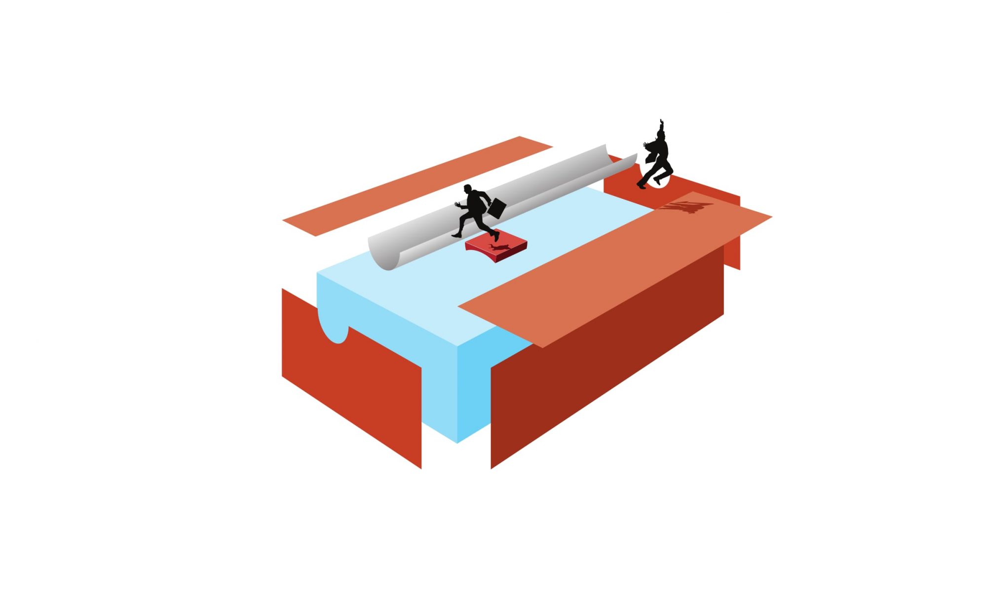
In his popular article The $300 Million Button, Jared estimated that this company was losing $300 million per year just by making it hard for repeat customers (and new customers as it turned out) to make their purchase. As he writes, “a little math and we could calculate out the amount of revenue being abandoned in the carts by all the people who couldn’t authenticate.”
It’s not rocket surgery*
I don’t know how many people Jared tested to get the result but I bet it wasn’t many. When you sit down and actually watch people use websites you start to see patterns emerge very quickly.
This simple user testing reminds me of McDonald’s founder Ray Kroc stalking his competitor’s car parks to observe customers. He could never have developed the sophisticated operating and delivery systems without spending much of his time on the shop floor, observing, experimenting, learning, and modifying as he constantly honed the customer experience.
When was the last time you or any manager you know sat down for an hour in a reception area (or went with a technician on a service call, or listened in while someone called the call centre, etc.) of your organisation and took notes?
The customer (experience) is always right
I’ve been working with a national health organisation to begin an audit and review of their website content. Auditing content seems like an abstract concept and I’ve been trying hard to get management to realise how important it is that their stakeholders – sufferers of the illness, state-based members and government funders – can find what they’re looking for. They’ve been much more interested in getting a new web content system. I was getting nowhere until I started to watch people using their website.
Method
I had access to some of their previous research. The research company had asked people why they came to the website and offered them four choices – ‘to find News’, ‘Services’, ‘Contact us’ and an ‘Other’ option. (It baffles me why you would ask people to identify one of only four tasks when websites are entirely composed of many and varied tasks.)
Based on the proportion of people who chose each option and drilling down to the verbatim comments I came up with 5 tasks which I tested my four subjects on:
- Find news on treatments
- Find news on medication
- Find news on clinical trials
- Find our services
- Contact your state organisation
And I was astounded at the results. Every person I tested failed on the top 4 tasks. Not just failed but failed miserably to find anything resembling the information I had asked them to find. Now I’m not saying this was the best trial that had ever been designed. But based on the time and resources it would make a good pre-trial to begin the discussion about what’s actually happening on the site.
The subjects had all remarked on how professional the site looked – it has glossy pictures of happy people – but when it came to the crunch it just wasn’t usable. How professional is it really when your site visitors can’t find or do anything on your site? How important is the web content management system when your visitors give up after a few minutes and try and find out what they’re looking for on Google?
Start pushing $300 million buttons
As a result of some very quick and simple testing with real people, I’ve now started the discussion about the important aspects of website management and away from the trivial… I may have found this organisation’s $300 million button – or at least the $3,000 button. We’ve all got to look for our organisation’s customer experience buttons and start pushing them. It’s not that hard to observe customers in their natural habitat. They’re usually quite happy to do it. Just ask.
*In his book Rocket Surgery Made Easy, Steve Krugg (Advanced Common Sense) suggests simple techniques for doing user testing.
Related links
- Don’t get mad, get data
- “There’s no humanity in technology”
- Don’t kick sand in the face of web content: tasks
To find out how to receive free expert advice see Digital Enterprise Program Melbourne.